Real Estate
I led the redesign of Oakwood Homes’ digital platform — a Top-11 U.S. homebuilder — creating a seamless online experience that enables users to configure and purchase homes entirely online.
Product
Desktop, Tablet, & Mobile
Skills
User Research & Testing
Product Design
Interactive Prototyping
Design Systems
My Role
Lead Designer
Year
2024

Problem
Turning uncertainty into confidence
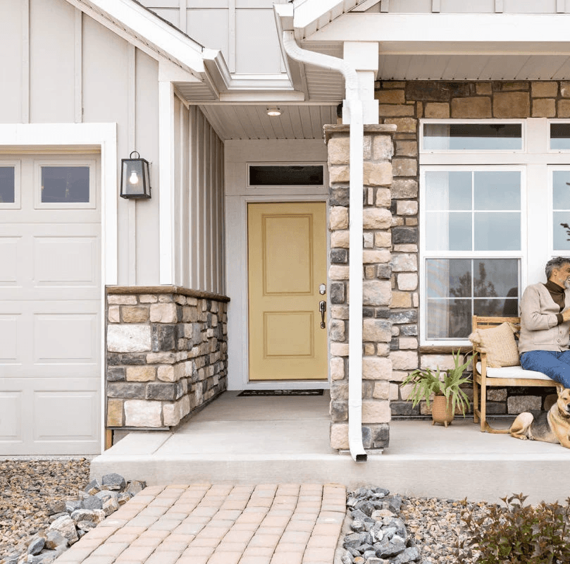
Oakwood Homes was struggling with conversions and attracting new users, but the deeper challenge wasn’t design responsiveness — it was trust. For first-time buyers making one of life’s biggest financial decisions, confidence is essential. The goal was to create an intuitive, credible experience that removes friction and gives users the assurance to complete their purchase online.

Research
Where users hesitate
Stage 1
60.07% of users fall within one standard deviation of the mean time it took for users to browse an available home
37 participants in a controlled group of 26 - 49 years of age
32.17s ≤ 60.07% of users ≤ 60.6s
Stage 1
79.87% of users fall within one standard deviation of the mean time it took for users to configure and buy a home
37 participants in a controlled group of 26 - 49 years of age
40.3 s ≤ 79.87% of users ≤ 212.2s
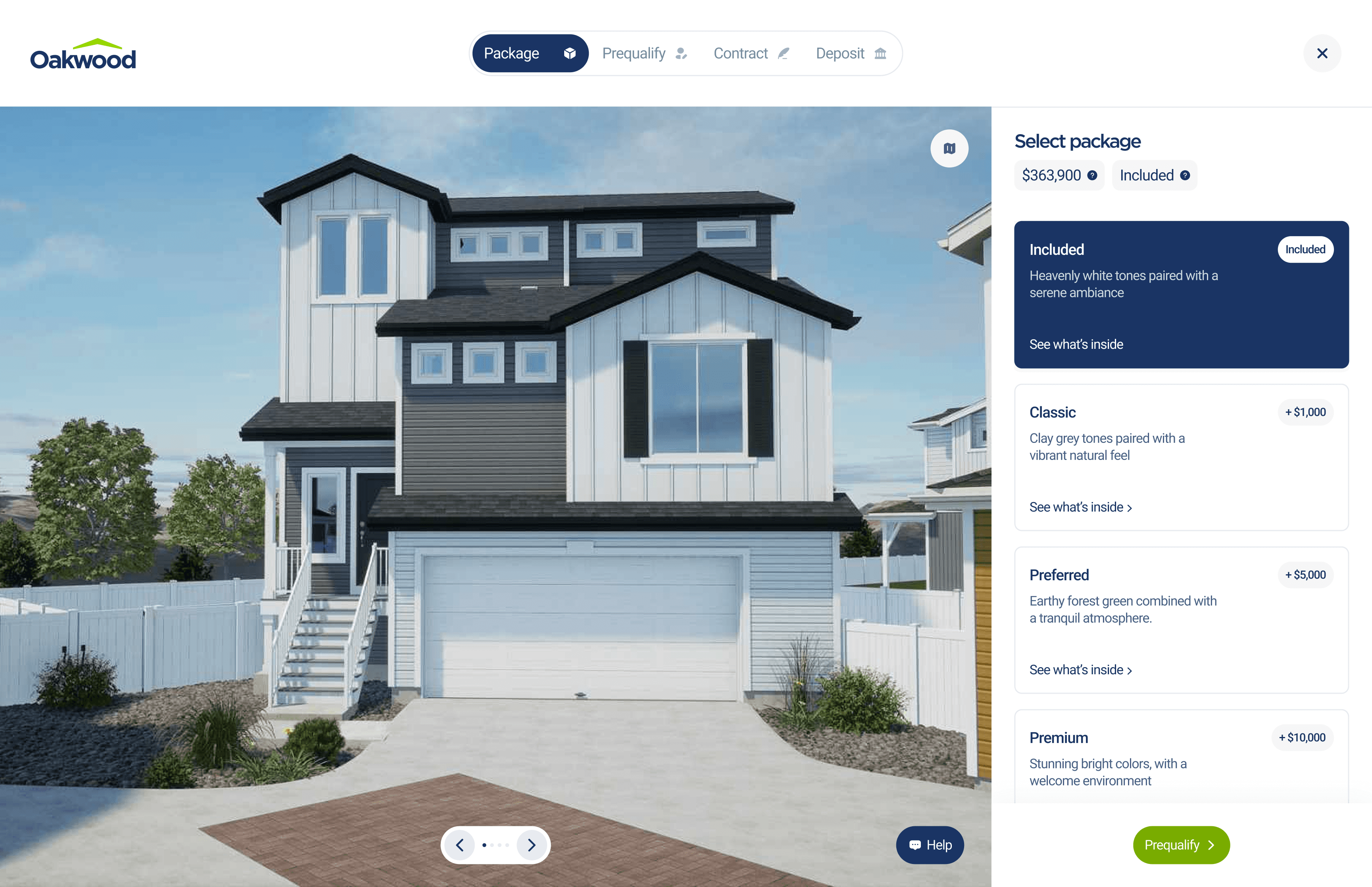
Solution
Designing for clarity and control
User testing revealed that hesitation wasn’t caused by lack of features, but by moments of friction and uncertainty throughout the journey. To improve completion confidence, the experience was redesigned to make navigation clearer, decisions easier, and key information always accessible.
Key improvements included
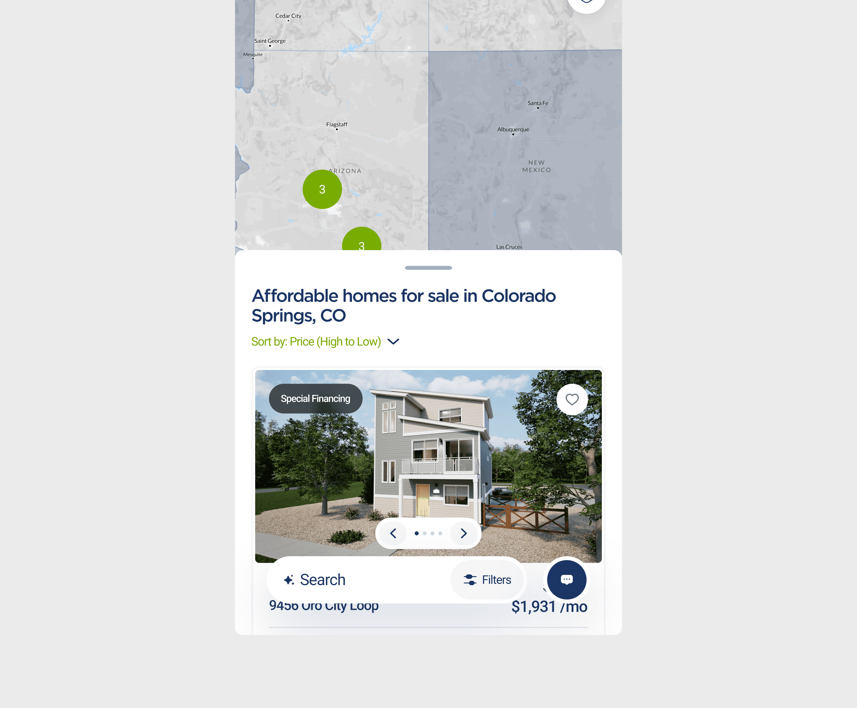
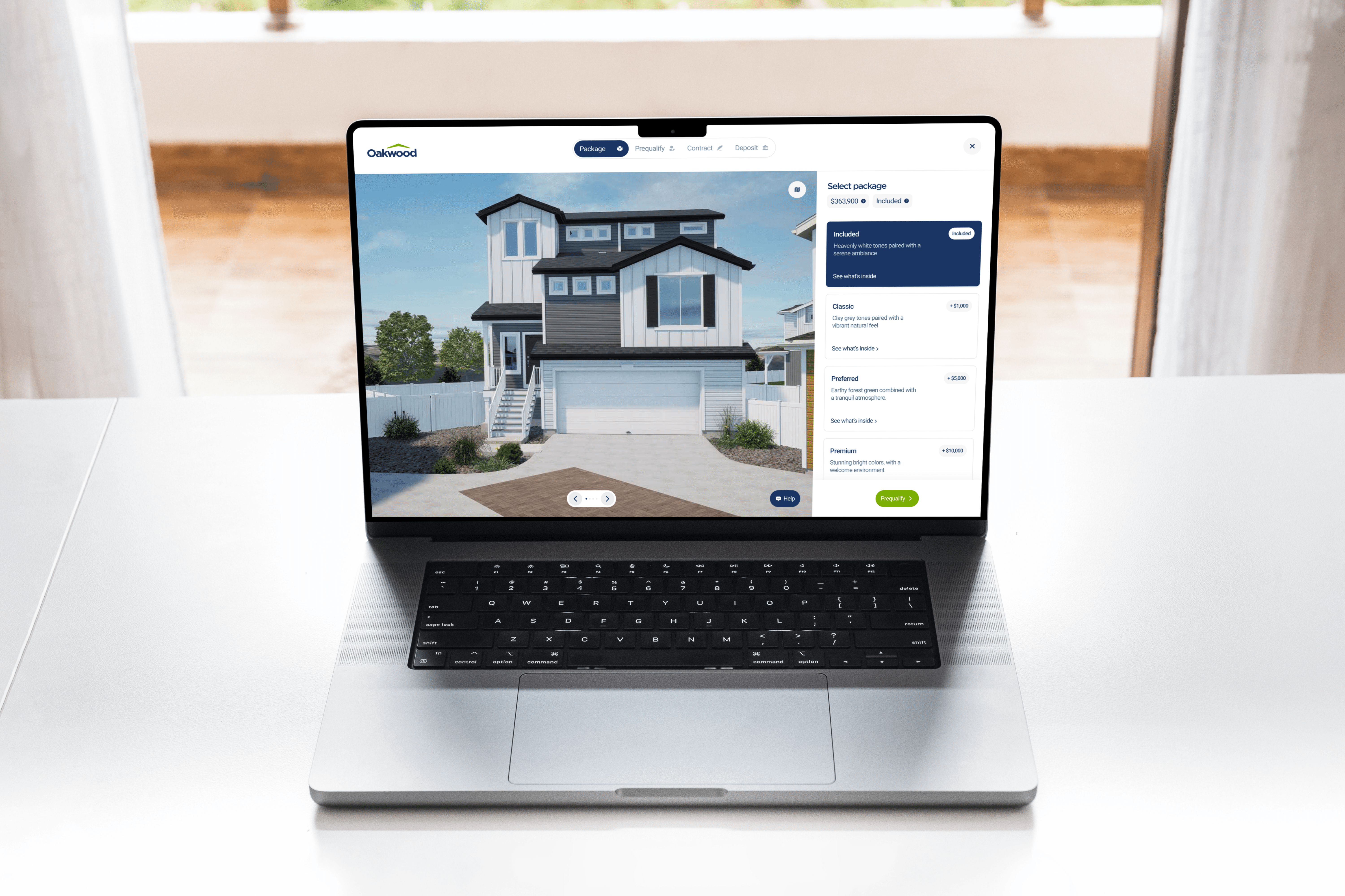
Clearer CTAs on the homepage
Accessible filters within the Find Your Home experience
Incentives redesigned to give users control
Added sorting with a clear H1 on the map interface
Persistent reference buttons for pricing and packages
24/7 AI Integrated Live Chat Support
Research
Improvement after iteration
Stage 2
91.24% of users fall within one standard deviation of the mean time it took for users to browse an available home
37 participants in a controlled group of 26 - 49 years of age
15.93s ≤ 91.24% of users ≤ 52.17s
Stage 2
93.68% of users fall within one standard deviation of the mean time it took for users to configure and buy a home
37 participants in a controlled group of 26 - 49 years of age
62.29s ≤ 93.68% of users ≤ 146.91s
Takeways
Confidence drives conversion
Designing for first-time homebuyers isn’t just about usability — it’s about trust. By reducing friction, clarifying decisions, and keeping key information accessible at every step, the experience shifted from uncertain to reassuring. The result was measurable improvement in task efficiency, fewer hesitation points, and a platform that better supports users through one of life’s biggest purchases.
By turning hesitation into confidence, the experience didn’t just become easier to use — it became easier to trust. And when users trust the journey, they’re ready to complete it.